MACAS: A Brand with No Layovers
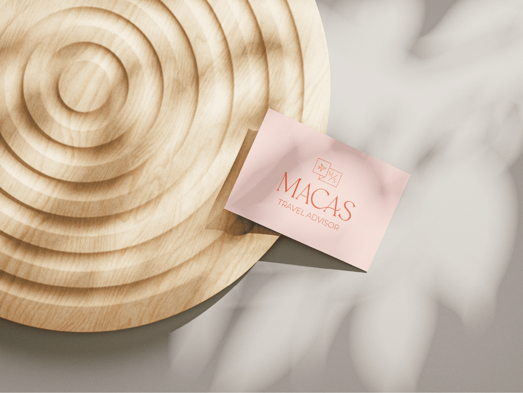
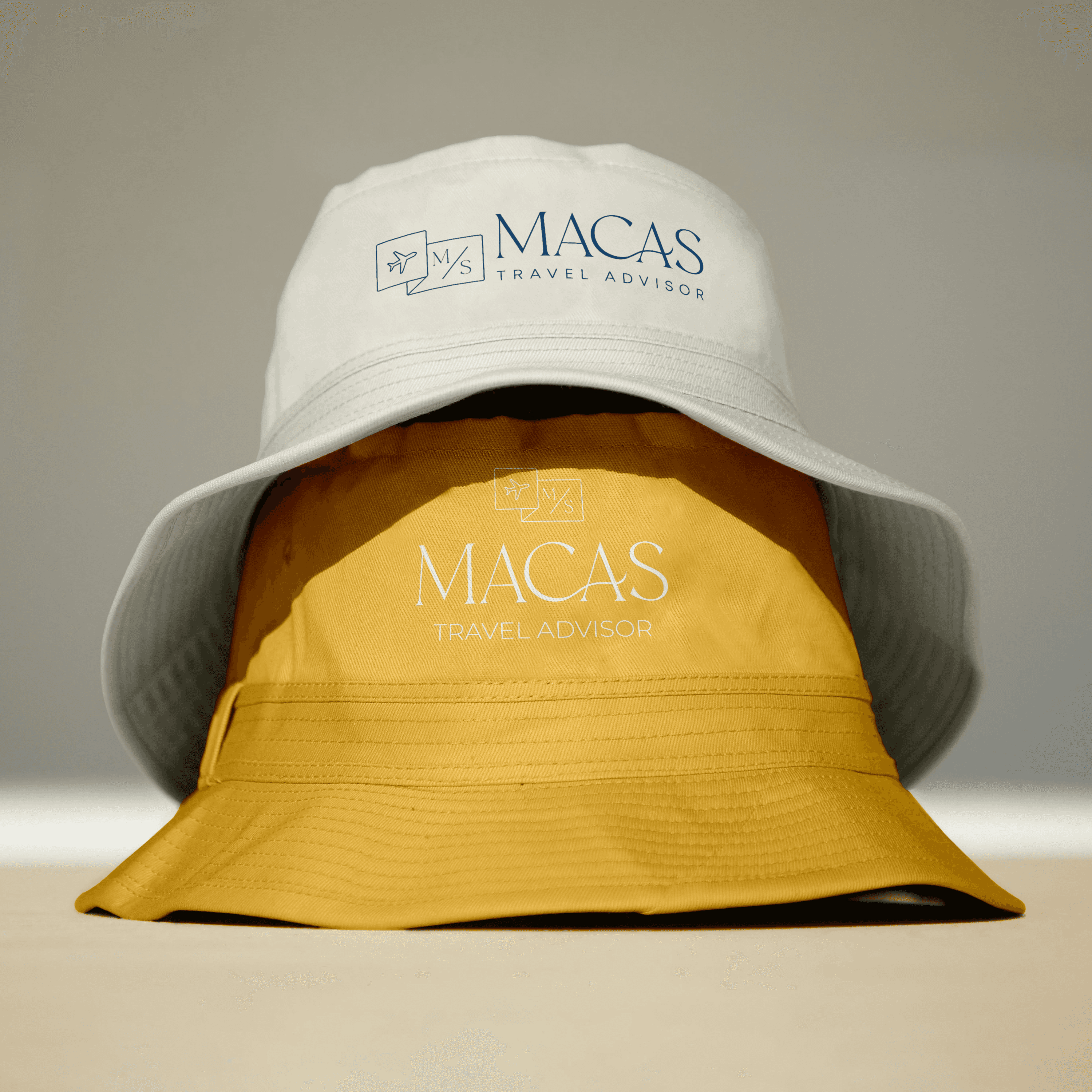
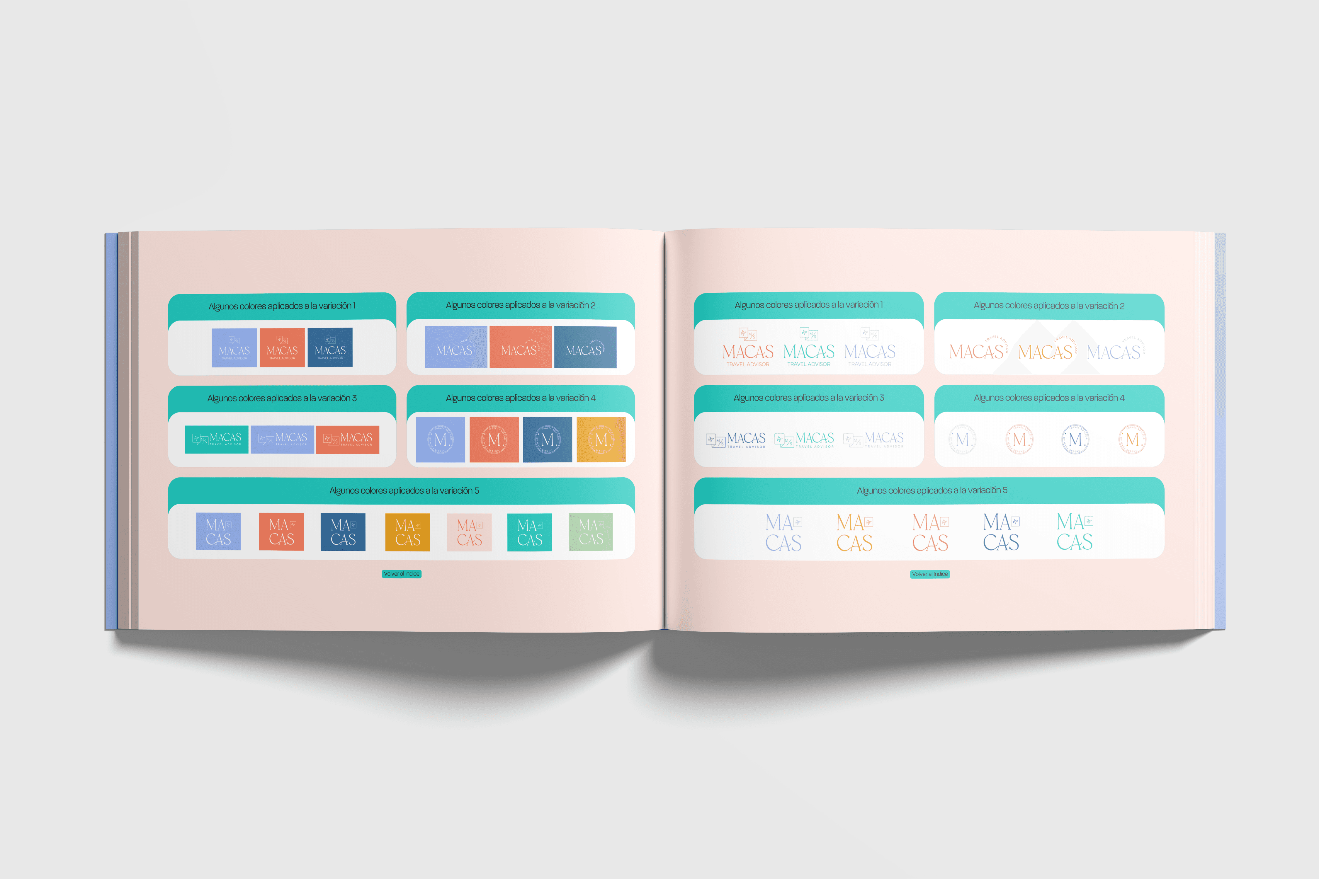
MACAS is a curated travel service built around taste, care, and intentional experiences. It’s designed for travelers who value personalization over mass appeal. I created a brand identity that reflects elegance with an editorial edge, combining visual simplicity with emotional impact. The logo features a custom serif wordmark paired with a minimalist icon that suggests both movement and signature service. The symbol evokes the idea of travel as something personal and expressive. The overall layout and visual rhythm support a premium but approachable tone. The color palette captures the diversity of travel moods. From calm and refined to vibrant and bold, each color variation opens up space for the brand to shift between destinations and client styles. The typography system blends clarity with softness, allowing content to feel human, modern, and confident across digital and print. This identity includes logo variations, brand colors, font hierarchy, social media templates, and creative direction for photography. It gives MACAS the flexibility to grow as a brand while staying consistent in every visual expression.
Client
Macarena Sereno
DELIVERABLES
Year
2025
Role
Graphic Design