ProTech Care: Linking Care to Community.
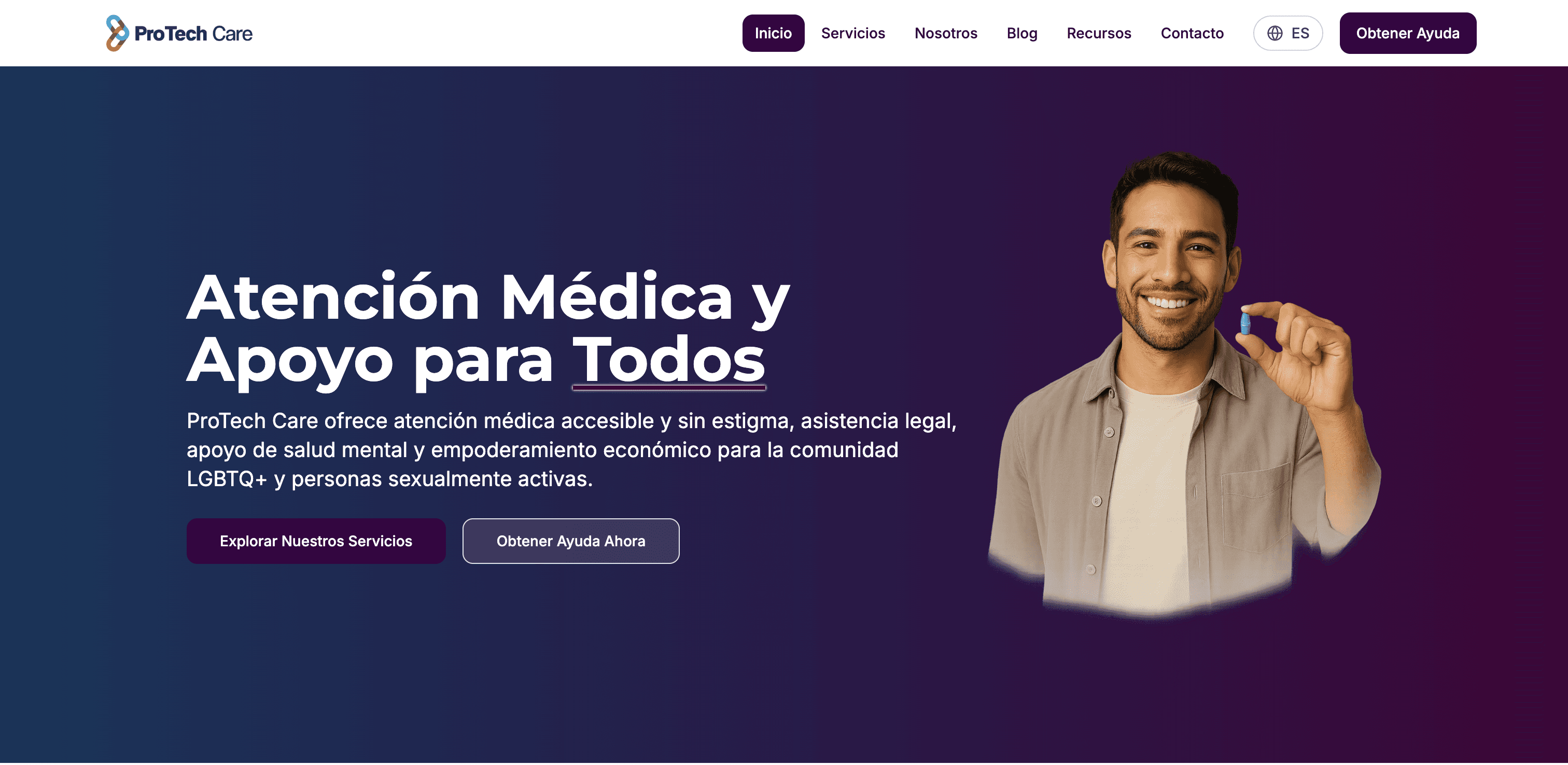
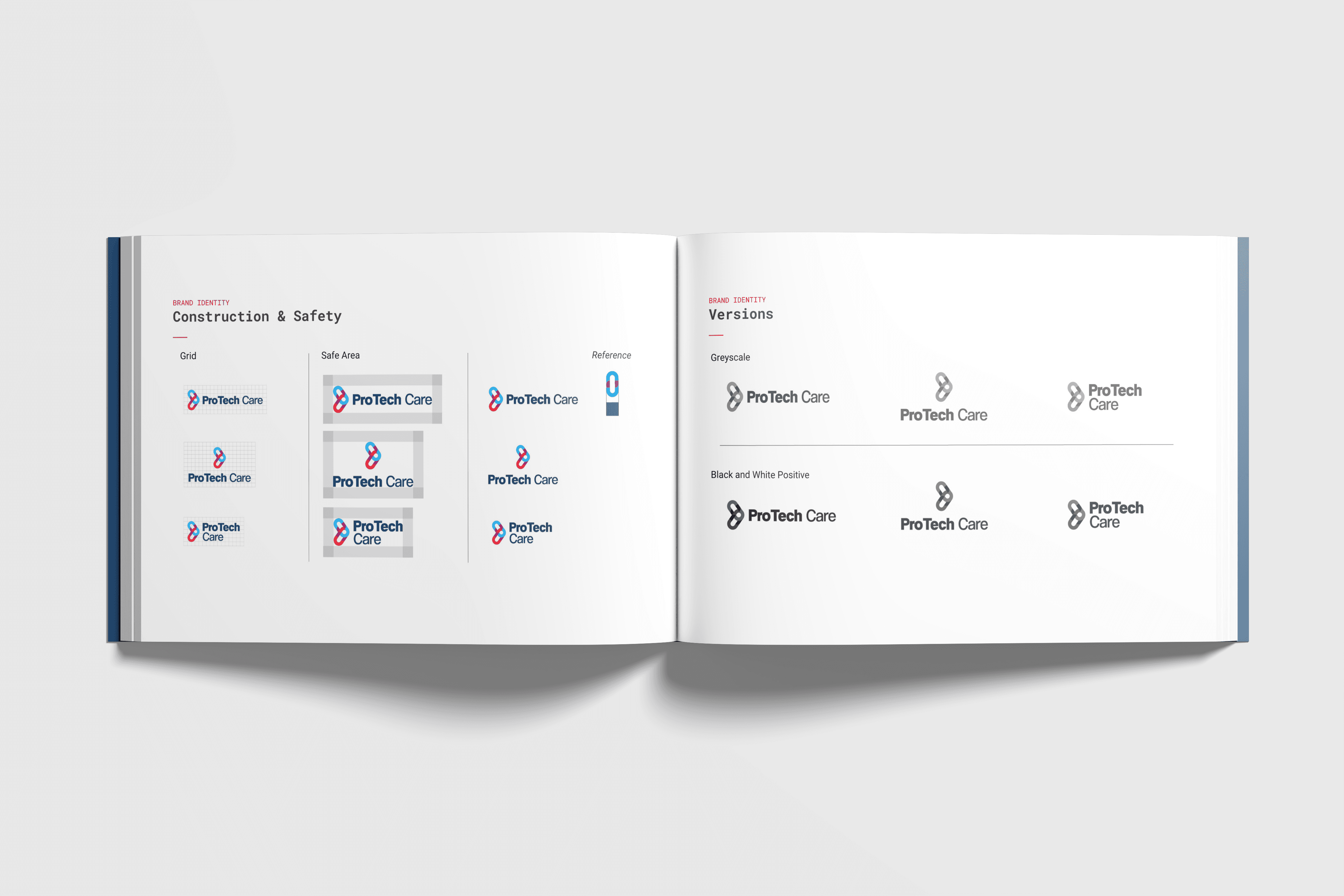
ProTech Care is a nonprofit organization that provides inclusive healthcare access, digital support, and community advocacy for LGBTQ+ individuals in Miami-Dade. Their work focuses on connection, visibility, and equity in health and wellness. I developed the brand identity from the ground up, beginning with a logo that symbolizes unity and collective care. The icon is a modular link, made up of distinct segments that fit together to create a complete form. This represents how care happens in parts, through people, services, and technology coming together to form something stronger. The design uses a geometric, grid-based structure that conveys trust, stability, and purpose. The color palette blends cool tones like blue and purple to express calm and inclusivity, with selective use of red for moments that require focus or action. The typography is clean, open, and easy to read across both digital and print formats. This identity was designed to be highly adaptable. It supports digital campaigns, educational materials, social media, and future platform development. The overall system reflects ProTech Care’s values of access, affirmation, and innovation in community health.
Client
Marketing Agency
DELIVERABLES
Year
2025
Role
Content Creator | Graphic Design