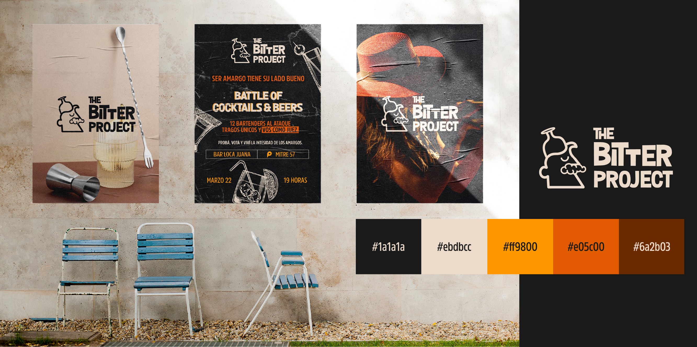
The Bitter Project: The bartender's battle.
THE BITTER PROJECT is a bartender competition where the audience acts as the judge. It’s also a space where bitterness becomes art—celebrating creativity, bold flavors, and intensity in every drink. The concept blends sophistication with freshness and modernity, with a fun twist that encourages exploring the unexpected. Logo Design The logo, unlike the event itself, embraces simplicity. It’s monochrome, featuring clean, minimalist lines and curves. The design tells the story of a character, balancing elegance and playfulness (with a foam mustache and a Gin & Tonic glass on the head). It’s a mix of classic and irreverent, meant to stand out in a contemporary setting. Color Palette • Beige: Neutrality and warmth, creating a balanced foundation. • Orange: Vibrant energy, creativity, and a nod to citrus. • Bright Yellow: Optimism and fun, highlighting the fresh, modern feel. • Dark Gray: Sophistication and depth, grounding the design. • Brown: Nature and tradition, connecting with earthy ingredients like roots and spices. A harmonious blend that conveys intensity, warmth, and modernity, just like the project itself.
Client
Bar Event
DELIVERABLES
Year
2024
Role
Graphic Design